- Design
Interaction design best practices: Give value to get value


Research into interaction design suggests more than a quarter of users are abandoning an app after they sign up and use it once – the culprit? Not enough consideration of user experience. Including Gradual Engagement in app design rather than slapping a user with a sign up screen at first entry, could be all the difference!
Imagine this: - you’re window shopping and you spot something that catches your interest. You decide to head into the store to check it out. You want to feel the fabric, try it on, maybe check the price tag.
As you enter, a shop assistant stands across the doorway with arms outstretched. “Sorry, before you can come in, I’ll need your email address.” Confused, you either hand it over reluctantly or exit the store.
Seems pretty far-fetched I know, but that is essentially how many apps treat new users when they are still forming their first impressions of a product.
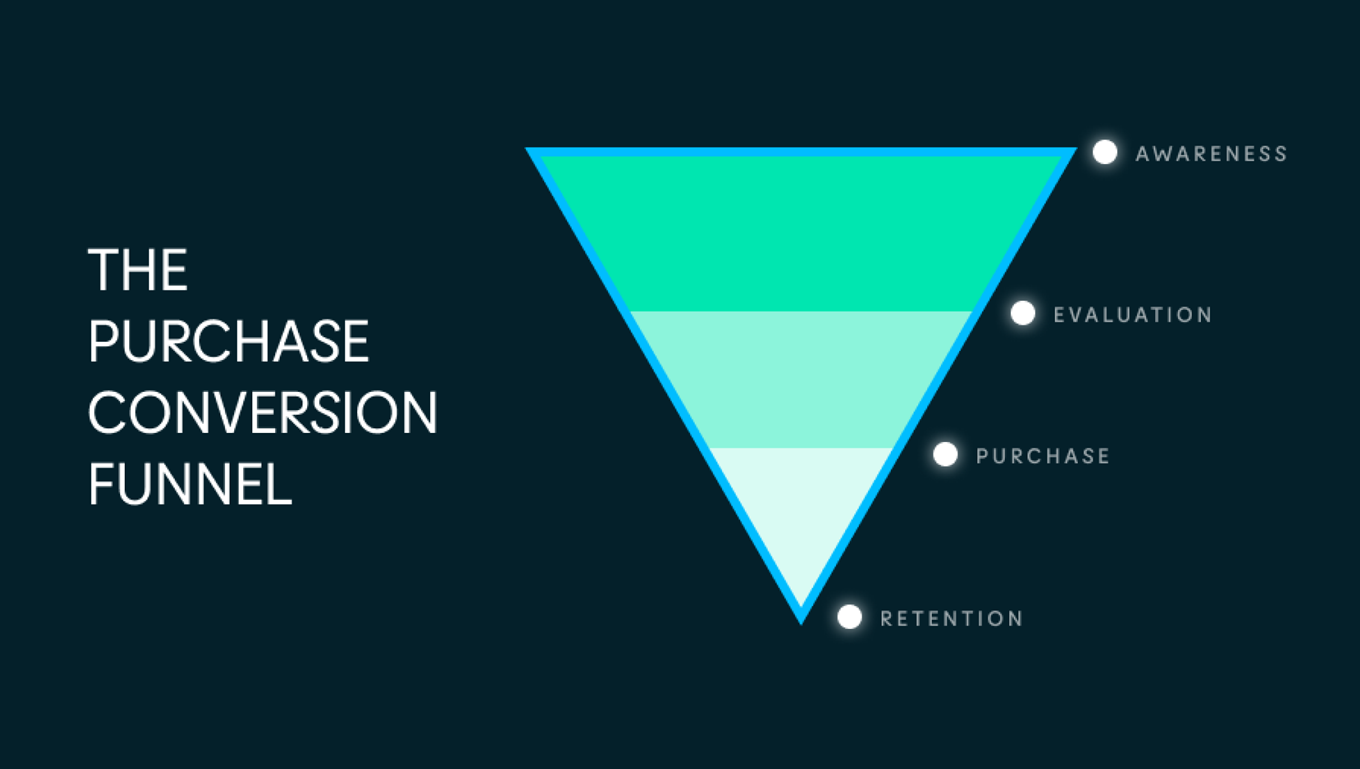
When purchasing a product, customers tend to follow a conversion funnel like the one above. Beginning at awareness, customers hover around evaluation before landing at purchase. By making your app’s first screen a sign up flow, you’ve unfortunately created a roadblock to the evaluation stage for the customer.
Interaction design research shows personal information is valuable
Personal information is valuable. For the user, it can be summed up like this:
My contact details are valuable to me, I am reluctant to give them away to a business that I don’t have a relationship with
When we ask our users for something of value, before delivering something of value, we risk losing their engagement.
Therefore when and how we introduce this request for personal details is vital to engagement.
Let’s look at a relatively standard user journey through the conversion funnel. Sam is thinking about trying meditation and wonders if an app can help. They open the App Store and there’s a handful of free apps with good reviews and in-app purchases.
Next, they download a couple to try. Sam has moved from awareness into evaluation in the funnel, as they are keen to learn more.
The evaluation stage allows a user to get up close and personal, feel the product, see how it works, view the cost and inclusions, maybe give it a test run before they decide to commit with either their dollars or personal information.
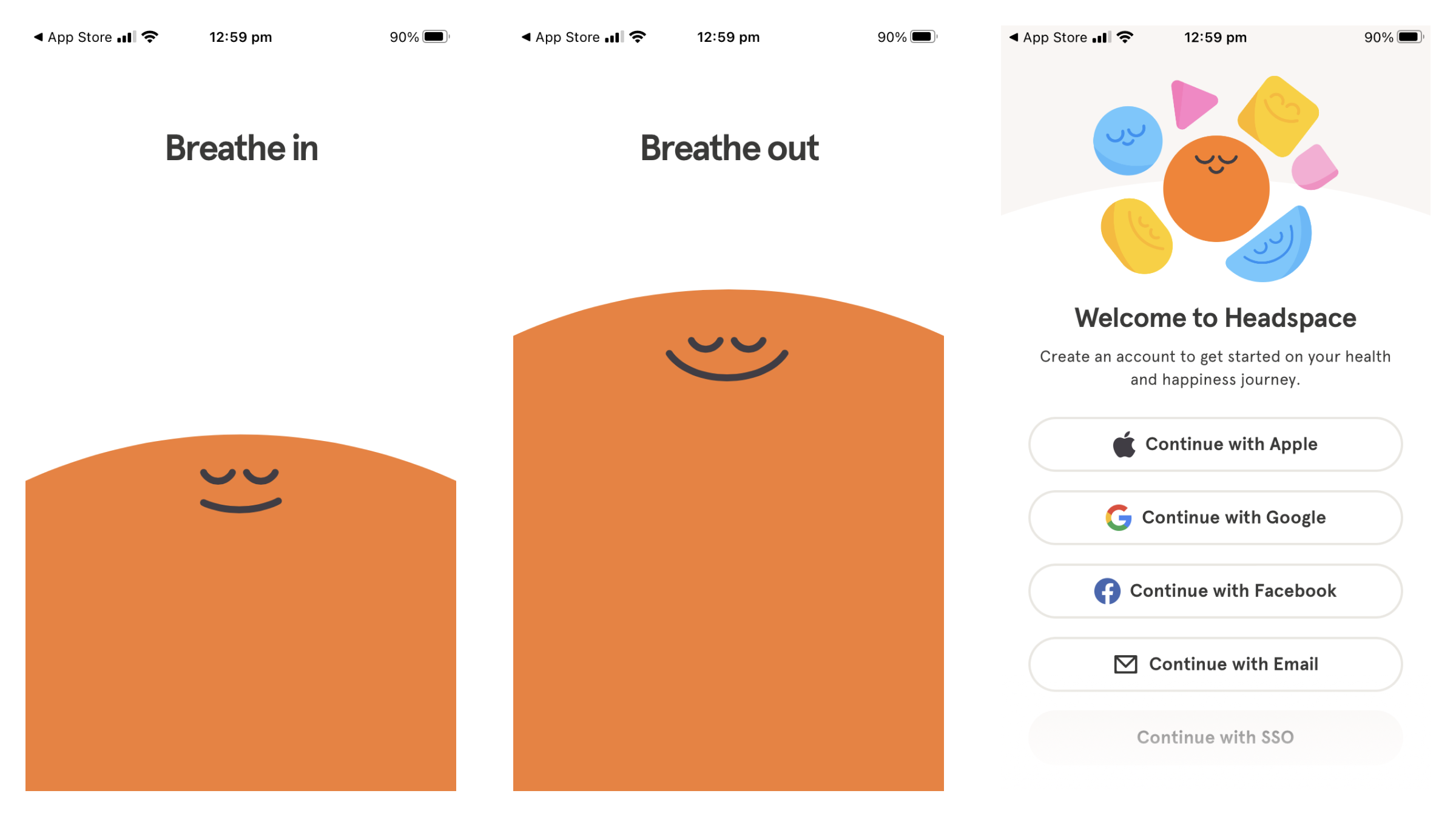
Sam opens the first app. Warm colours, relaxing visuals. It gives off a great vibe. But then a sign up form surfaces. The evaluation flow is interrupted and Sam needs to create an account before they can continue on their evaluation journey.
And here’s where things could (and often do) go pear shaped.
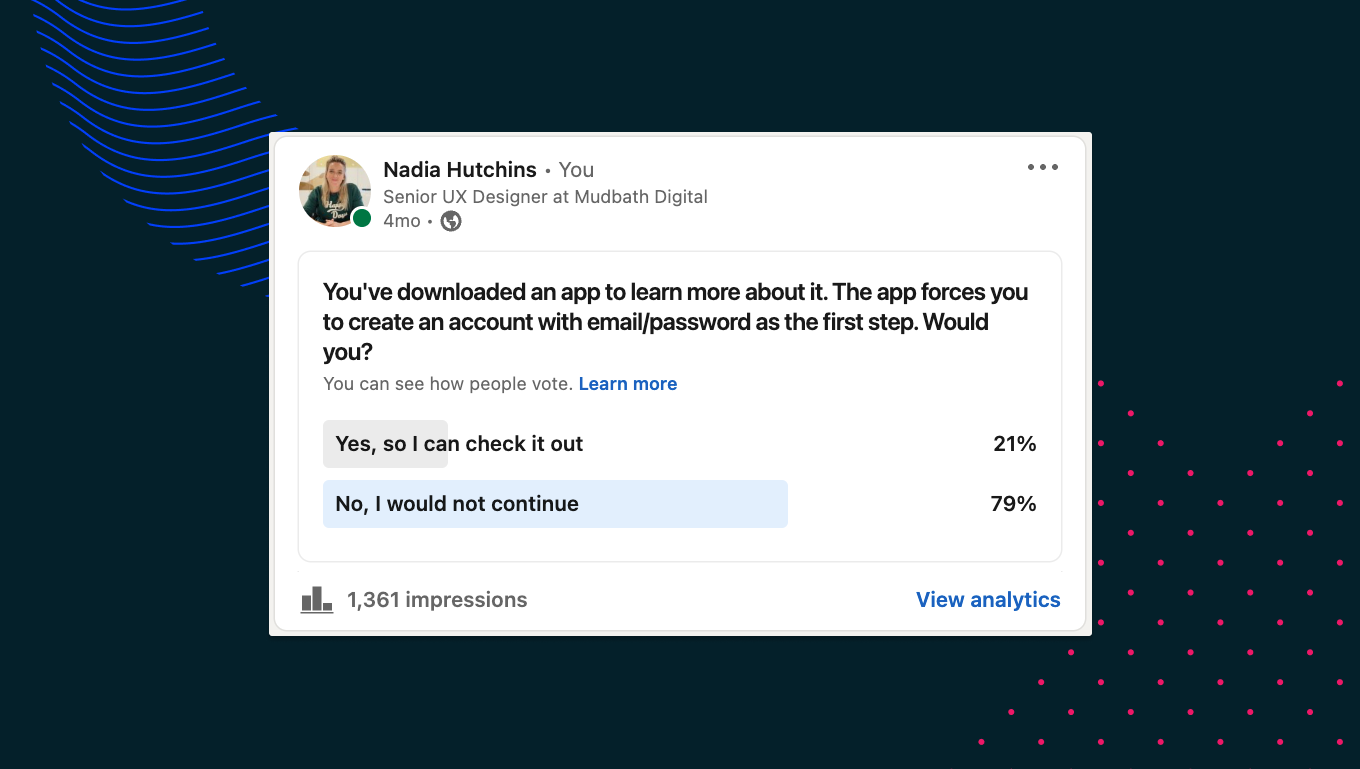
Interaction design research from 2019 shows that 25% of users abandon or delete an app after a single use. Anecdotal evidence has that number much higher, with 79% of respondents confirming they would delete an app they were only considering if required to sign up as the first step.
How to use Gradual Engagement to create a better UX
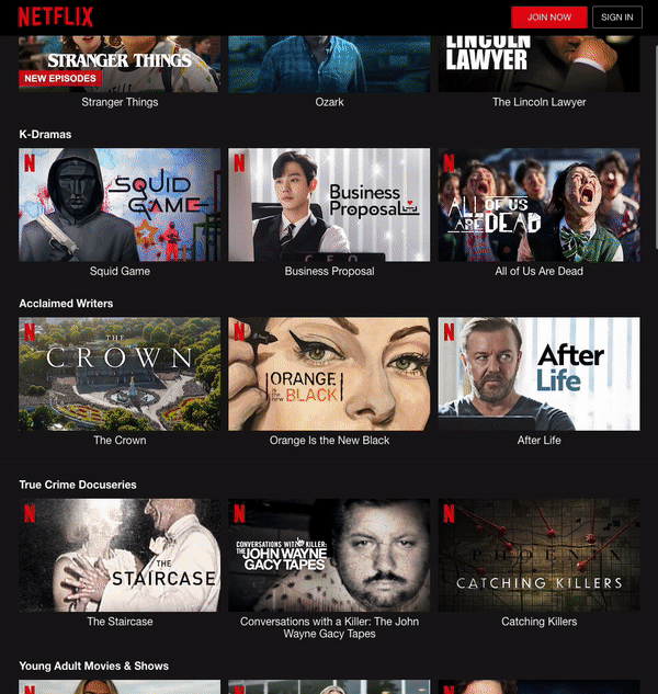
Let’s look at another evaluation flow from Netflix where sign up is delayed until after the evaluation stage.
Netflix knows how much choice is in the market, and has therefore invested heavily in the evaluation stage. They let a prospective user interact with their user interface, browse their entire catalogue, view seasons available, even watch trailers. Essentially they can truly evaluate a purchase before parting with either their personal information or their cash.
Aren't there exceptions to the rules of interaction design?
Always. If we are talking about user experience, then we are talking about all users, which means there will never be a one size fits all solution.
In 2016, accounting software company FreshBooks introduced their first ios app. They wanted to take many of the features of their successful desktop software and adapt them for ‘on-the-go’ use in an app.
Their goal was to create a ‘Frictionless Getting Started’ flow and give users value as soon as they launched the app, without having to create an account. This meant a new user could create an invoice, or log a trip, all in an unidentified state. It was only when they wished to save information to the cloud that signup was required. Through user testing however, they found this feature acted as a deterrent.
Users were confused as to where their data was being saved - Was it to a new account? What if they already had an account? By listening to their users and undertaking interaction design research, they changed their flow and offered three options on the welcome screen; Log in, Create an account, or Tour the app without an account.
The designers of Madgex Job Posting found something similar when they removed account creation for people applying for jobs. It was so successful at boosting conversions they decided to remove account creation for recruiters posting job ads too. Interestingly, in testing, it failed dismally and here’s why. Recruiters didn’t want to spend 15 minutes creating a job ad if they didn’t have confidence their work was being saved somewhere. They preferred registering up front.
The key takeaway is the need to balance gradual engagement to retain new users in the evaluation stage, with the security and peace of mind for users who enter data as part of trying out your app. There is not going to be a definitive rule, but instead we need to match the goal of the user with the right onboarding flow.
If account creation is vital, what can be done?
If you are working on an app that will not function if account creation isn’t part of onboarding, there’s still ways to use the principles of gradual engagement:
- Consider using welcome splash screens that sell the features of your app and then move account creation from the first step in your onboarding to the last. The information a user enters would be saved locally to the app until they create an account as the last step. In doing so, you give your user a brief glance at the look and feel of your product, which can help them evaluate whether to continue.
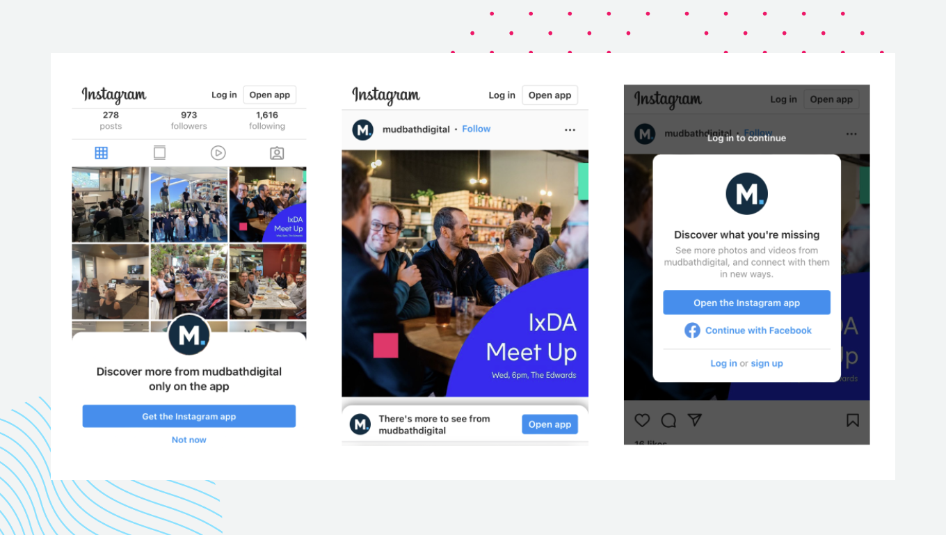
Alternatively - Allow first time users into your experience, let them explore your features and content then trigger a sticky sign up modal after ‘x’ event, such as 20 seconds or 4 clicks. Similar to the Instagram non-logged in user experience seen below
UX Testing will make your product better
Whatever you decide to do with your sign up flow, test it. Before you launch your new app or product it is vital to test the onboarding process with users who have never used your app before. Your goal in testing should be to get insights into their first impression of your app, is the flow intuitive, are there real or perceived roadblocks and is there enough value up front to make it worthwhile to overcome these challenges?
Listen to their feedback and adjust your flow accordingly with a user first approach. Your end product will always be better for having undergone user testing before launch.
Remember, first impressions count. You have just a few seconds to capture the attention of your user and get them engaged in your product. Use those first screens wisely.
_________
At Mudbath, we are specialists in creating user experiences and digital products that are intuitive, grounded in research and a joy to use. If you have a product or idea you need help with, please get in touch.