- Design
An Intro to Colour Theory and Psychology in Web Design


The impact that colour can have in web design is often overlooked by the average person, however the choice of colour scheme when designing a website is very important.
Colour Psychology
The psychology of colour can be defined as “the science of how colour affects human behaviour”.
Colour is not just about aesthetics - it also communicates specific information. Additionally, these meanings are based either in learned associations from repeated pairings of colours with particular messages, or biologically-ingrained responses to colours in different situations.
These associations are evaluated to be either positive or negative, and these evaluations will often produce motivated behaviour; expressed either as an Approach or Avoidance response.
Considering the psychological response to colour, it is likely that individual experience and cultural context also plays a significant role in responding to colours.
Colour Theory
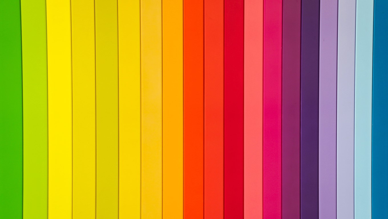
Another similar area of study is Colour Theory, which can be defined as “the interaction of colours in a design through complementation, contrast and vibrancy”.
Colour plays a significant role in how a user receives a design, and each of the following three elements combine to determine reception.
Complementation is the balance between different colours in the same space. Complementing colours will be more appealing to a user, and result is less strain for the eye.
Contrast is the strong dividing of elements. As well as also reduces eye strain, this creates a salient focus point for the user's attention.
Vibrancy (related to hue) is the brightness of the colour, and affects the emotional response of the user. Brighter colours lead the user to feel more energetic as a result of your design, which is particularly effective when you are trying to advertise a product or invoke an emotional response. Darker shades relax the user, allowing their mind to focus on other things.
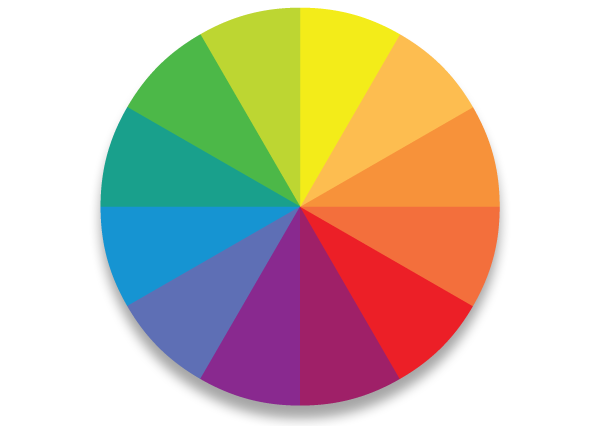
In colour theory, there are three main kinds of effective colour scheme:
Triadic
Colours that are equal distance from each other on the colour wheel. For example red, yellow and blue. Triadic colour schemes give a feeling of balance.
Compound (Split Complementary)
A range of complementary colours is chosen. This "allows more freedom in their design while also benefiting from the visual appeal of complementary colours". This colour scheme is vivid but not overpowering. An example of this colour scheme is yellow, orange, blue and purple.
Analogous (Monochromatic)
These are a series of consecutive colours, or shades of the same colour. Analogous schemes differentiate colour using contrast and vibrancy. These colour schemes typically are well blended and harmonious. For example, blue, teal and green are analogous colours.
The colours you choose directly impacts the user's experience because different colours invoke different emotions - depending on the user. For example, blue relaxes, refreshes and cools; it produces tranquil feelings and peaceful moods, and creates trust with the user. Because of this, many social networking sites, banks and other companies that need user trust use blue as a core part of their colour scheme.
***
In addition to creating trust and positive affect, the choice of colour scheme provides a focal point for the user's attention. Providing well-balanced contrast and vibrancy in a design (typically in the form of triadic, compound or analogous schemes) creates salient objects to draw the eye and therefore a visually pleasing space. This encourages the user to remain engaged in the website for a longer period of time.
As you can see, colour plays an enormous role on the initial impact that a user experiences when visiting your website. The basics of colour theory and psychology will go a long way to ensuring that your website looks appealing and engaging to your users.
***
References
- Elliot, A., & Maier, M. (2007). Color and Psychological Functioning. Current Directions In Psychological Science, 16(5), 250-254. doi:10.1111/j.1467-8721.2007.00514.x
- Lim, H. The Effect of Color in Web Page Design. Austin, Texas: University of Texas.
- Cannon, T. (2012). An Introduction to Color Theory for Web Designers - Tuts+ Web Design Article.Web Design Tuts+. Retrieved 12 November 2014, from http://webdesign.tutsplus.com/articles/an-introduction-to-color-theory-for-web-designers--webdesign-1437
- Smith, J. (2014). How to Use the Psychology of Color to Increase Website Conversions. Kissmetrics. Retrieved 12 November 2014, from https://blog.kissmetrics.com/psychology-of-color-and-conversions/