- Design
Designing for dignity: creating accessible UX for people of all abilities


"Disability is not the problem. Accessibility is the problem"
- Mohammed Jemni, TEDx 2013
Access is an interesting thing. Think about the stairs you use to enter a public building, the gutter you quickly hop up as you’re crossing the street, the heavy door you push to get into an office. You may never notice these things until they become a barrier you can’t overcome. Access is an unnoticed advantage until it is inadvertently removed.

The medical vs social model of disability
The examples just mentioned can help to understand the two different ways we can view disability; the medical model versus the social model. The medical model asserts that disability is a health condition dealt with by doctors, whereas the social model sees disability as a result of an interaction between someone living with an impairment and their everyday environment.
How does the social model of disability relate to UX design?
If an online experience is accessible to users of all abilities, including someone using assistive technology like a screen reader, there is no disability experienced by someone with an impairment. For example, if a video on your homepage contains captions, a deaf user has the same ability to understand the content as the hearing community. If the contrast ratios between your text and background passes AA standard, a colourblind user has the same ability to decipher and understand the content as a non-colourblind user
Our job as UX designers is not to make people feel ‘other’
While it’s not as common in modern design, in the past, it was common for the accessible entrance or bathroom to be in a separate area to the main entrance or bathrooms. While this may have made sense when building, what it did in practice is make people with accessibility needs feel ‘other’ or ‘separate’.
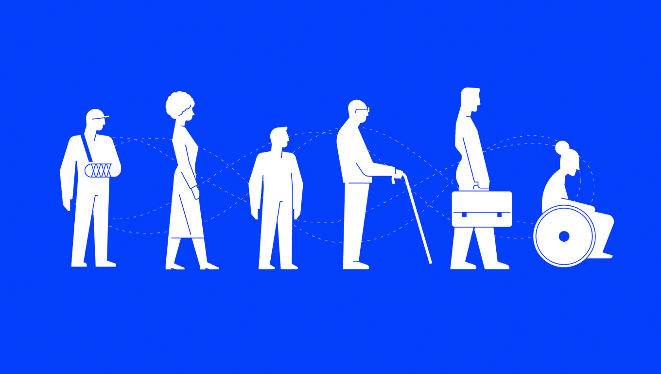
With one in five Australians identifying as having a disability, our job as UX designers is not to make people feel ‘other’.
Just as we would expect people of all abilities to enter a public space, we should also expect people with all types of abilities to access the online experiences we create. That’s why we need to create online interfaces that are operable and understandable by all users.
How can I design for users of all abilities?
A good start is the WCAG.20 guidelines. Here we will cover just a handful of them, but we encourage you to read them in detail to help inform your UI design.
Text alternatives
Captions make a big difference; to deaf users, users with English as a second language and even to users in noisy or chaotic environments such as public transport. When a user cannot hear what is being said in video content it is important to hardcode captions into the video or provide a transcript.
Colour
Colour should not be the only visual means used to convey information. For example, a colourblind user may not be able to decipher between a green square and a red square. They are relying on a tick icon or the ‘Approved’ wording to indicate success.
Text and images need to have a contrast ratio of at least 4.5;1. In practice this means there needs to be enough contrast between the colour in the foreground with the colour in the background so the text or icon can be understood by a user with low vision.
A good tool for checking colour contrast is the Vision Australia Colour Contrast Analyser.
Images
Images should support body text, but not convey meaning that can’t be understood by the text alone. For example, if you need the user to understand that the car is red, the body copy should explain that the car is red. People using screen readers (such as people who are blind or have low vision) cannot see images.

Alt tags help people using screen readers to better understand an on-page image. Make sure your alt-tags are useful to the reader. For example, the alt-tag ‘women smiling’ does not convey a lot of meaning but ‘three female colleagues in their early 20s laughing while working on laptops in a cafe’ conveys meaning to the reader.
Text size
It is generally accepted that 16pt font should be the minimum font size for body copy and a user should be able to resize the text on the page up to 200% without loss of content or function.
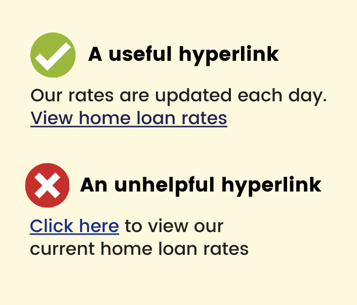
H1, H2, H3 headings and useful links
Screen readers allow users to skip between headings and links. Users might skip the body copy and choose to hear only the headings and links to help them quickly navigate the site. For this reason, make sure your H1, H2 etc headings are in order and you provide useful hyperlinks.
Here is an example of a hyperlink that conveys no meaning: ‘Click here to view our current home loan rates.’ Here is a useful hyperlink that conveys meaning when read in isolation. 'Our rates are updated each day. View home loan rates.'
Plain English
A study on adult literacy released by the ABS in 2013 showed that over a third of Australian adults are functionally illiterate. This doesn’t mean this group can’t read, they can. It means they lack the literacy and comprehension skills needed to complete most tasks in everyday life. For example, reading and understanding dosage requirements on a medication bottle or understanding how to register a vehicle online.
As UX designers this creates an opportunity to ensure all content we write adheres to Plain English principles. Not only will people with low literacy be able to understand the content, but it will be easier for all users if jargon and technical terms are not used.
Some key points about Plain English
- Write to a year 8 - 9 reading level. A good way to test your text is through the Flesch Kincaid Reading Score calculator.
- Avoid jargon and complicated words.
- Keep sentences under 14 words.
- Try to use one syllable words in headings.
- Use active verbs and ‘we’ and ‘you’.
- Avoid writing in all caps.
- Use headings and bullets to break up text.
User testing
Remember to test with users of all abilities including older users with low vision, people with a learning impairment or intellectual disability or someone using assistive technology. It will ensure a better end product for all.
We’re here to help you deliver user interfaces and websites that are a joy to use by people of all abilities. If you have a digital product or idea that you need help with, please get in touch.